Printable template
Blank Line Graph
Axes and grid for plotting.
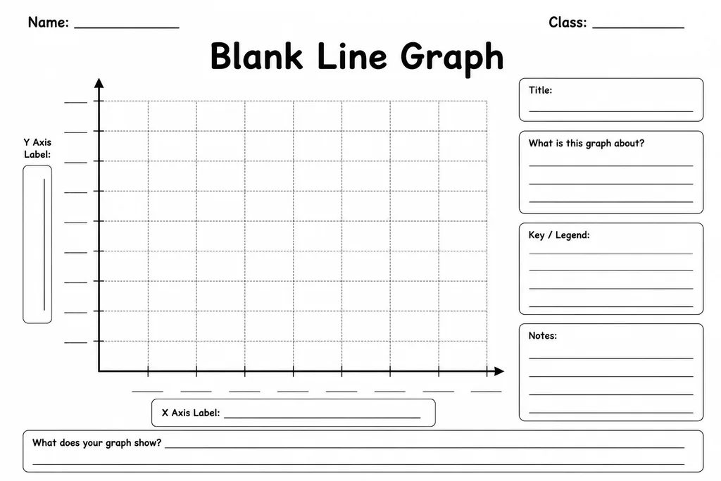
This blank line graph template provides a clean set of axes with an evenly spaced grid, giving students in grades 3–8 a professional-looking scaffold for plotting continuous data without the distraction of setting up their own scales. The horizontal x-axis and vertical y-axis are clearly printed with tick marks, leaving the labels and scale numbers for students to define based on their specific data set. Science experiments, temperature readings, population changes, and story-problem tables all translate naturally onto this grid. Teachers use it across maths, science, and social studies lessons; older students appreciate the fine grid for more precise plots and trend analysis.
Learning objectives
- Plot ordered pairs accurately on a coordinate grid
- Label and scale both axes appropriately for a data set
- Identify and describe trends shown by a line
- Connect changes in data over time to real-world context
- Compare two data sets by plotting multiple lines
- Practise interpolation and extrapolation skills
How to use this template
- Download and print the blank line graph template on letter or A4 paper.
- Write a graph title and decide what each axis represents, then label both axes.
- Choose an appropriate scale and write numbers along each axis using the tick marks.
- Plot each data point with a small dot, then connect the points with a ruler.
- Add a legend if you are plotting more than one line, using different colours or dash styles.
Classroom & home ideas
- Record daily high temperatures for two weeks and plot the line to discuss seasonal trends.
- Conduct a science experiment measuring plant growth every few days and graph the results.
- Plot two sports teams' monthly scores on the same graph to compare performance over a season.
- Use population data from a social studies unit to create a historical line graph.
- Have students sketch a 'distance vs. time' graph after a walking experiment in PE.
Skills practised
Frequently asked questions
How many data points can this template handle?
The grid comfortably fits 10–12 data points along the x-axis. For longer data sets, students can widen the intervals or use two sheets joined together.
Can it be used for negative values?
Yes. Students simply place zero in the middle of the y-axis and extend the scale downward with negative numbers, which makes it ideal for temperature or profit-and-loss data.
Is this template suitable for Year 3 students just learning graphs?
It works well from grade 3 onward. For younger students, pre-label one axis before printing so they only need to plot points rather than set up the full scale.
What's the difference between a line graph and a bar graph template?
A line graph shows change over time or continuous data trends; a bar graph compares separate categories. Use this template when your x-axis represents time or an ordered measurement.
Likes & comments
See what other teachers think and share a helpful note.
Create more worksheets in our Worksheet Studio
Generate fresh worksheets for any grade, topic, and language — free.
Open the Worksheet StudioRelated worksheets

Triangular / Tessellation Grid
Frequency Table Template
Fraction Wall (Blank)
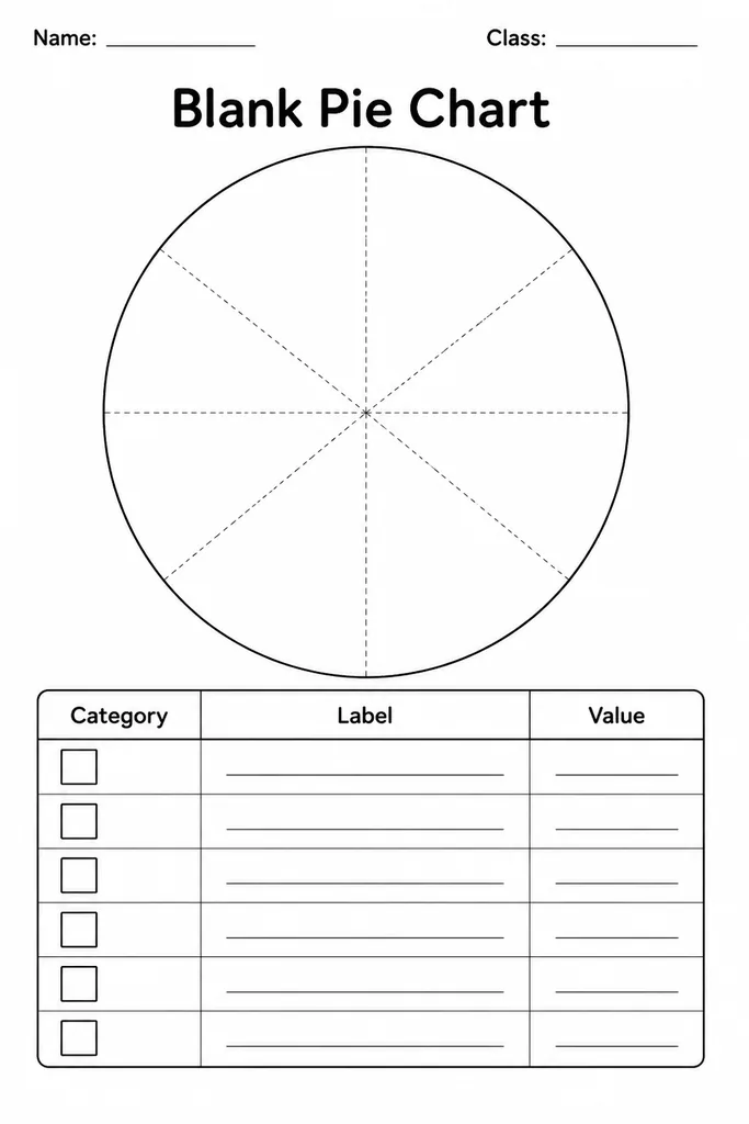
Blank Pie Chart
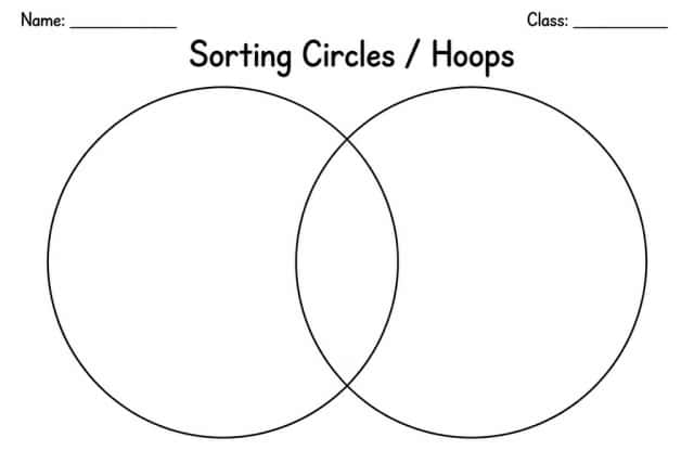
Sorting Circles / Hoops
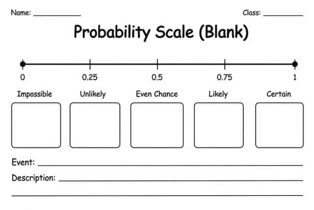
Probability Scale (Blank)
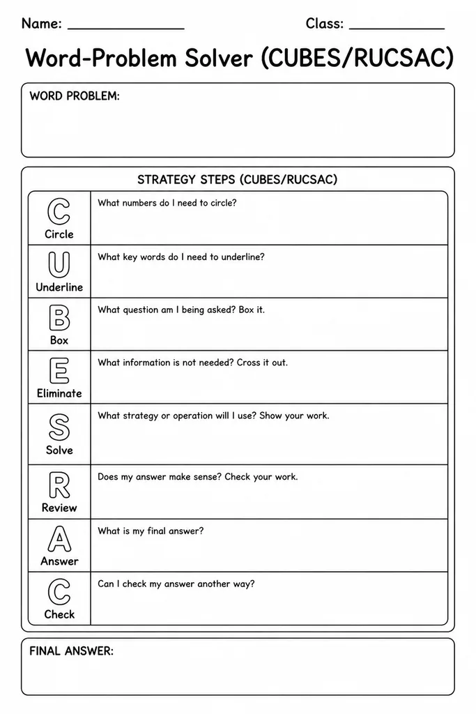
Word-Problem Solver (CUBES/RUCSAC)