Printable template
Warm / Cool Colours Sort
Two-zone blank colour sort.
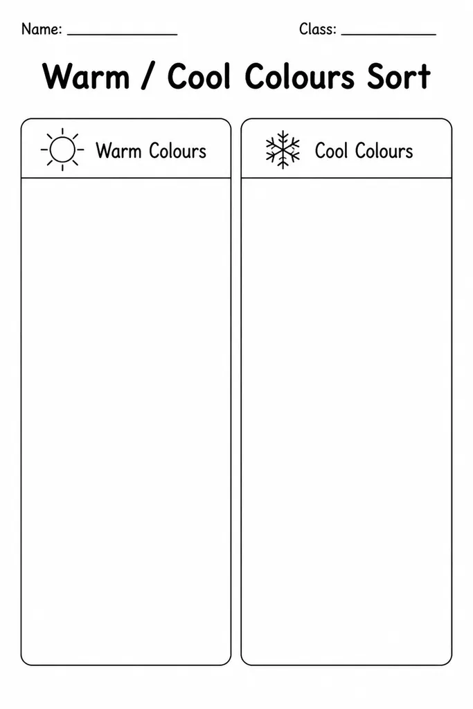
This two-zone sorting template presents a large warm-colour region and a large cool-colour region side by side, both completely blank so students fill, paint, or paste colour swatches where they belong. Designed for grades 2–6, it is the go-to handout for introducing the warm/cool colour split in any primary or intermediate art room. Teachers use it as a guided practise after a colour-theory mini-lesson, asking students to mix or swatch directly in the zones. Parents print it at home alongside a set of crayons so children can explore colour vocabulary independently. The open format means it works equally well as a sorting game (cut and paste colour chips) or a painting exercise (dab and label).
Learning objectives
- Identify and classify colours as warm or cool
- Understand that warm colours (reds, oranges, yellows) advance visually and cool colours (blues, greens, violets) recede
- Practise mixing or selecting hues that fit each temperature category
- Connect colour temperature to mood and emotion in art
- Build colour vocabulary (hue, tint, shade, temperature)
- Apply sorting and categorisation skills in a visual context
How to use this template
- Download and print the free PDF; each sheet has two clearly labelled zones.
- Provide paint, crayons, or pre-cut magazine colour swatches for students to place in the correct zone.
- Students fill or paste colours, then add the colour name as a label inside each swatch.
- For a discussion extension, ask students to find a colour (such as brown or grey) that doesn't fit neatly and justify its placement.
- Display completed sheets side by side on a bulletin board to compare how different students interpreted the boundary colours.
Classroom & home ideas
- Paint chip sort: collect hardware-store paint chips, cut them up, and have students glue them into the correct temperature zone on the template.
- Magazine collage: students cut warm and cool images from magazines and paste them into the matching zone, creating a full collage rather than just a swatch.
- Watercolour wash: students paint each zone using only warm or only cool watercolour washes, blending different hues within the zone to show range.
- Emotional response discussion: after colouring, students write one word inside each zone describing how that temperature of colour makes them feel — a bridge to language arts.
- Interactive display: laminate a class set and use sticky-backed colour dots or dry-erase markers so students can re-sort for multiple lessons across the year.
Skills practised
Frequently asked questions
What colours count as 'warm' and which count as 'cool' on this template?
Warm colours are typically reds, oranges, and yellows. Cool colours are blues, greens, and violets. Colours like yellow-green or red-violet sit on the boundary and make great discussion starters.
Is this template suitable for kindergarten and Year 1 students?
It works best from grade 2 onward when students have enough colour vocabulary, but a simplified version using just red/orange/yellow versus blue/green can work for Year 1 with teacher guidance.
Can students use this template for digital art tools?
Yes. Open the PDF in an app like Procreate, Canva, or Google Slides and use the fill or brush tool to colour each zone digitally. It works well on tablets in a 1:1 device classroom.
How does this template connect to the wider colour wheel?
The warm/cool split is the first step toward understanding colour relationships. After this template, students are ready to explore complementary pairs, analogous schemes, and colour harmony on a full colour wheel.
Likes & comments
See what other teachers think and share a helpful note.
Create more worksheets in our Worksheet Studio
Generate fresh worksheets for any grade, topic, and language — free.
Open the Worksheet StudioRelated worksheets
School Event Coloring Pages Pack 2
Song-Writing Template

Pixel Art Grid 32x32 (Blank)
Zentangle Frame
Artist Study Template

Minecraft-Style Build Grid

Pixel Art Grid 64x64 (Blank)