Napkin AI for Teachers: Turning Text Into Classroom Visuals
A focused review of what the tool appears to do well, where teacher judgment still matters, and how to use it carefully in planning and instruction.
 By KiwiBee· KiwiBee
Last updated July 11, 2026
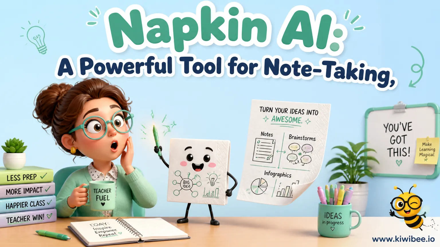
Teachers often need a quick way to turn a dense explanation into something students can see at a glance. A text-to-visual tool can help, especially when a lesson depends on sequence, comparison, or relationships between ideas.
Based on current help documentation, Napkin AI’s clearest documented workflow is this: it turns pasted or generated text into selectable visuals. You can generate a visual from a whole block of text or from a selected section, review different generated options and styles, and export the result in several common formats.
That makes it most useful as a planning and presentation aid rather than as an all-purpose classroom platform. For teachers, the practical question is not whether the visuals look impressive. It is whether they make the content clearer, more accurate, and easier to teach.
What Napkin AI is currently documented to do
The most solid, current description is narrow and useful. Napkin AI works from text. A teacher can paste text into a document, generate a visual from the full text or from a highlighted portion, and then choose among generated visual options and styles.
Once a visual is created, it can be exported as PNG, SVG, PPT, or PDF. A whole document can also be exported as a PDF in continuous, A4, or presentation format. Those export choices matter in schools because the same visual may need to appear on a slide, on paper, or in a digital handout.
What should be removed from older descriptions is just as important. Current help materials do not support claims that the tool is a real-time co-editing mind-map canvas. If you are evaluating it for department meetings, collaborative live mapping, or shared brainstorming boards, re-check the current product documentation and your school’s approved-tool list before planning around those uses.
- Documented workflow: text in, visual options out.
- Generation can start from an entire text block or selected text.
- Teachers can choose among generated visual styles and options.
- Exports include PNG, SVG, PPT, and PDF.
- Whole-document PDF export supports continuous, A4, or presentation format.
Where this can help teachers most
Its strongest classroom value is in converting teacher-written content into diagrams that reduce verbal load. If you already have a paragraph, list, outline, or draft explanation, the tool may help you produce a visual version faster than redrawing it by hand.
This is especially useful in lessons where structure matters as much as content. A procedural explanation, a compare-and-contrast summary, a cause-and-effect chain, or a sequence of events can often become more teachable when students can see the relationships instead of hearing them only in prose.
It can also support teacher preparation. A planning note that starts as text may become a visual overview for a lesson opener, a revision sheet, or a slide. The practical benefit is not that the tool replaces planning. It is that it may shorten the step between drafting an explanation and presenting it visually.
- Turn a written explanation into a board-ready diagram.
- Create a quick visual summary from a lesson outline.
- Convert a revision sheet draft into a more scan-friendly handout.
- Prepare a slide visual from the same text used in your notes.
Useful classroom workflows that fit the verified features
A simple way to use the tool is to start with a short, teacher-written text block rather than a long, mixed set of notes. The cleaner the input, the easier it is to judge whether the generated visual actually represents your intended meaning.
For direct instruction, draft a concise explanation of a topic, generate a visual from the whole text, then compare the output options. Choose the version that best matches the logic of the lesson, not just the one that looks most polished.
For partial reuse, select only one section of a longer document and generate a visual from that selection. This is useful when one part of your lesson needs a diagram but the rest works better as prose. It also helps keep the visual focused enough for students to read quickly on a slide or page.
- Workflow 1: Write a short explanation, generate a whole-text visual, and use it as a teaching slide.
- Workflow 2: Highlight one key section from a larger lesson draft and turn only that section into a diagram.
- Workflow 3: Export a finished visual as PNG for slides or digital platforms.
- Workflow 4: Export as PDF when you need a printable handout or a document to share in a standard format.
- Workflow 5: Export as PPT if you want to place the visual into a presentation workflow.
Examples of appropriate teacher use
In science, a short written explanation of a process can be turned into a visual summary for review. The aim is not to let the tool decide the science content, but to present your existing explanation in a more visible form.
In history, a brief draft on causes and consequences may become a clearer classroom diagram than a paragraph alone. This can help students discuss links between events, provided the teacher checks that the visual does not oversimplify or distort the sequence.
In English or language arts, a teacher can take a text explanation about themes, character contrasts, or argument structure and create a visual scaffold for discussion. The teacher still needs to confirm that labels and connections reflect the interpretation being taught, especially where literary analysis is nuanced.
- Science: process overviews and review diagrams.
- History: cause-and-effect or sequence summaries.
- English: theme, character, or argument structure visuals.
- General study support: topic summaries that reduce text density.
What to check before using a generated visual with students
Teachers should review visual labels and relationships before using generated diagrams as instructional material. This is the most important safeguard in the current fact pack.
A diagram can appear clear while still being wrong in small but significant ways. A label may be too broad, two concepts may be linked too strongly, or the order may suggest a relationship the original text did not intend. In some subjects, that kind of distortion can create misconceptions that are harder to undo than a dense paragraph would have been.
It helps to read the original text and the visual side by side. Ask whether the diagram preserves the exact meaning, whether any key qualification has been dropped, and whether the visual hierarchy matches what students need to learn first. If not, revise the source text, generate another option, or choose a different style.
- Check every label for accuracy and age-appropriate wording.
- Check whether arrows, groupings, or layout imply relationships you did not intend.
- Check whether important exceptions or qualifiers disappeared in the visual version.
- Check whether the diagram is readable at classroom display size and printable size.
- Check whether the chosen style supports learning rather than decoration.
Where caution is warranted
This is not a reason to avoid the tool. It is a reason to use it for the right job. If your goal is precise, shareable visual presentation from text, the documented workflow may help. If your goal is collaborative live mapping, note-taking across many contexts, or integrated classroom management, those uses are not supported by the verified fact pack and should not be assumed.
Schools should also apply their normal review process for digital tools. Follow local law, safeguarding requirements, approved-tool lists, and your own school policies before using any tool with student-related material or school accounts.
Finally, re-check current plan, access, and eligibility details before building a routine around the tool. Product details can change, and this review is limited to the verified features listed above.
- Use it for text-to-visual conversion, not for unsupported features.
- Do not assume collaboration or integration features without current verification.
- Follow school policy before using any tool in teaching workflows.
- Re-check current access details before relying on it long term.
A sensible role for Napkin AI in teaching
For teachers, Napkin AI is best understood as a practical text-to-visual aid. Its documented value is straightforward: start with text, generate visual options, choose a style, and export in a format that suits slides, print, or sharing.
That makes it potentially useful for lesson explanations, revision materials, and teacher-prepared diagrams where speed matters. Its limitations are also clear from the current evidence: teachers should not assume unsupported collaboration or note-taking features, and every generated visual needs a content check before it reaches students. Used that way, it can be a helpful formatting tool without being asked to do more than the documentation currently supports.
Sources and further reading
Explore the platform
Continue with KiwiBee
Choose the KiwiBee workspace or resource library that fits what you need next.
Related posts
How Teachers Are Turning AI Into a Classroom Superpower
From AI coloring books to animated student drawings, teachers around the world are finding inventive ways to bring artificial intelligence into daily lessons. Here are six practical ideas you can try this week.
NotebookLM as a Teaching Assistant: A Comprehensive Guide
Google's NotebookLM transforms how teachers and students interact with learning materials. From mind maps to audio summaries, here are seven features every educator should know.
From Blank Page to Complete Lesson Plan in 4 Minutes
AI doesn't write my lessons for me. It gives me a starting point I can argue with. That distinction matters more than you'd think.
 For big organisations
 For schools
 For centers
 For team leaders
 For teachers
 AI and resources
 Printable worksheets
 Teacher tools
 AI studio
 Ideas and research